Finbingo's One Stop Finance.
Finbingo Website Redesign: Prioritizing user needs and leveraging user testing and UX Analysis to create a platform that fosters informed investment decisions and streamlines financial management.
Company
Finbingo
Domain
Investment & Portfolio Management
Industry
FinTech
Timeline
4 months
Team Size
3 UX Designers
2 Visual Designers
Role
UX Research & Analysis
What is Finbingo?
Offers automated financial advice and portfolio management. The goal of the platform is to make financial advisory more accessible and affordable. Features- Portfolio management, investment monitoring and asset management.
Scenario
Finbingo wanted to make things easier for its users. People were getting lost, confused, and overwhelmed by the complicated terminology and processes.
Challenge
Improve the user experience to make the platform more intuitive, engaging, and effective for a wider range of users.
Results
Identified 7/11 issues related to Content, Terminology & Visual Design. Ideated and prototyped several blockers and major issues to streamline the user experience and allow users to perform tasks seamlessly.
81.7%
Overall Success Rate of the Usability Test
11
Issues Identified
Let's break it down.
The website was complicated, with confusing terms and overwhelming options. Our goal was to simplify the experience, making it easier for people to understand and use.
We wanted to create a friendly and approachable platform that helped users achieve their financial goals without feeling overwhelmed.
Problem Identification
Heuristic Evaluation
User felt lost in a bunch of financial terms and complex interfaces.
33.3% Minor Problems- The platform doesn't "speak users' language". The use of technical jargon without explanation can confuse users who are not well-versed in the terminology. They may struggle to understand what is expected of them.
22.2% Major Problems- Interfaces contain information that is irrelevant or rarely needed. Every extra piece of information adds to confusion.
User Research
Survey
Interviews
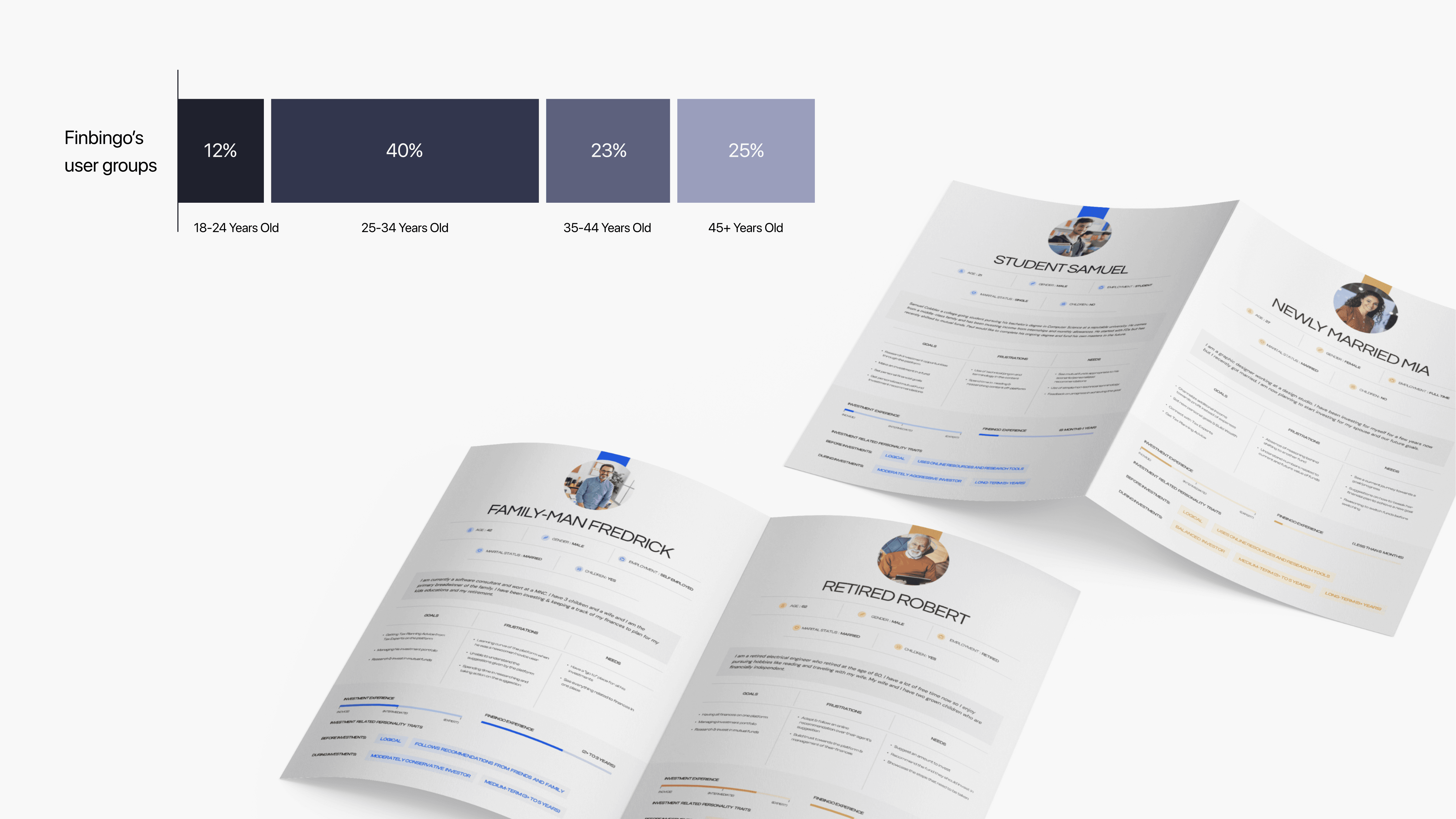
User Personas
Next step was: Who these users are and what their major challenges are.
40% of our participants were adults of the age group 25-34
60% of our participants identified themselves as males, 30% females and 10% preferred not to say
50% of our users are intermediate users. I.e. They have some experience in investments but are still learning.

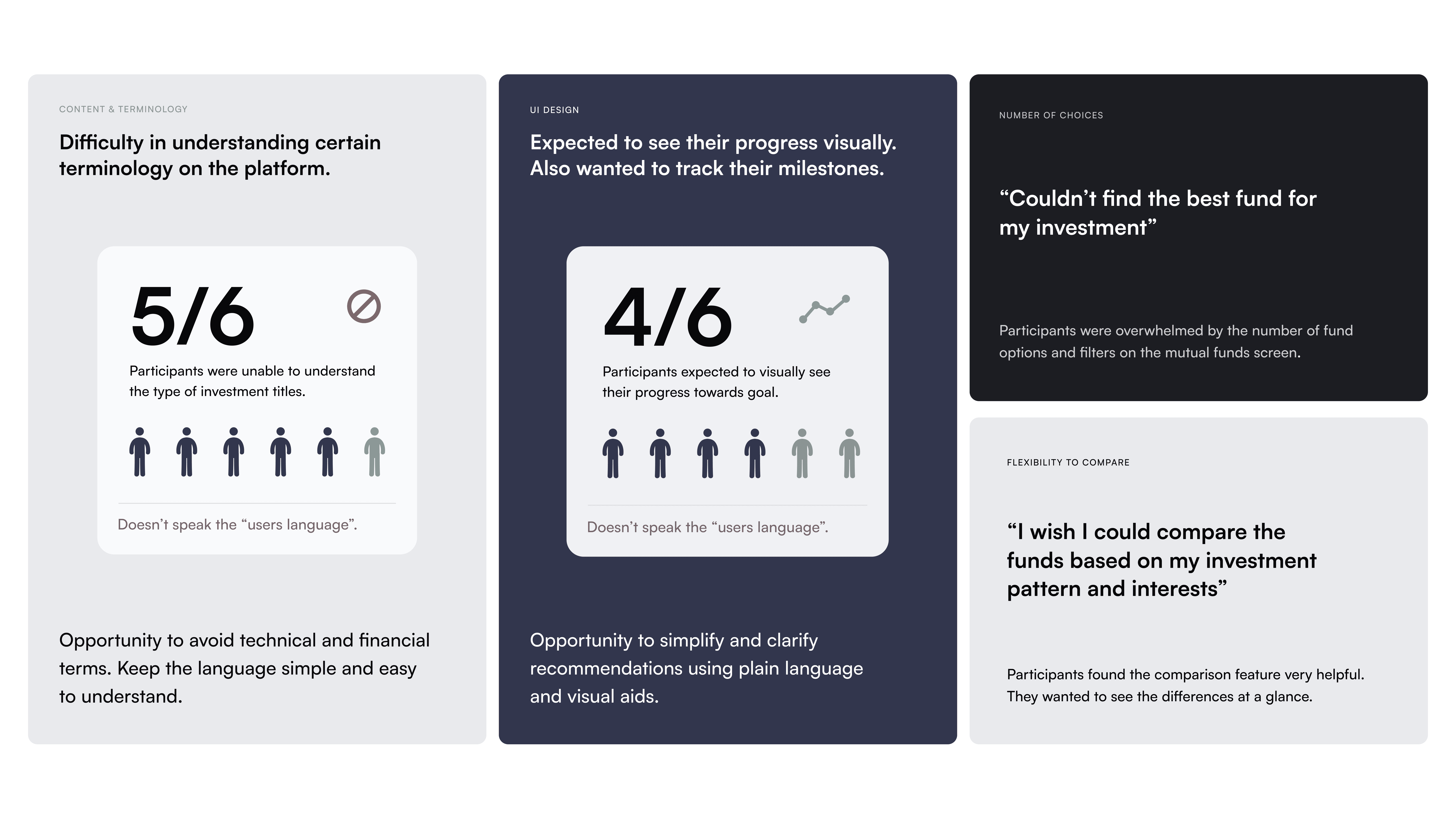

Usability Testing
Conducted usability testing to observe users' interactions and identify areas of difficulty.
6 participants were tested. There were 4 Male & 2 Female Participants.
11 Issues were identified.
4/11 issues were related to UI (Visual Design)
2/11 issues of different scopes were identified in the information form.
2/11 issues of different scope were identified in the goal analysis
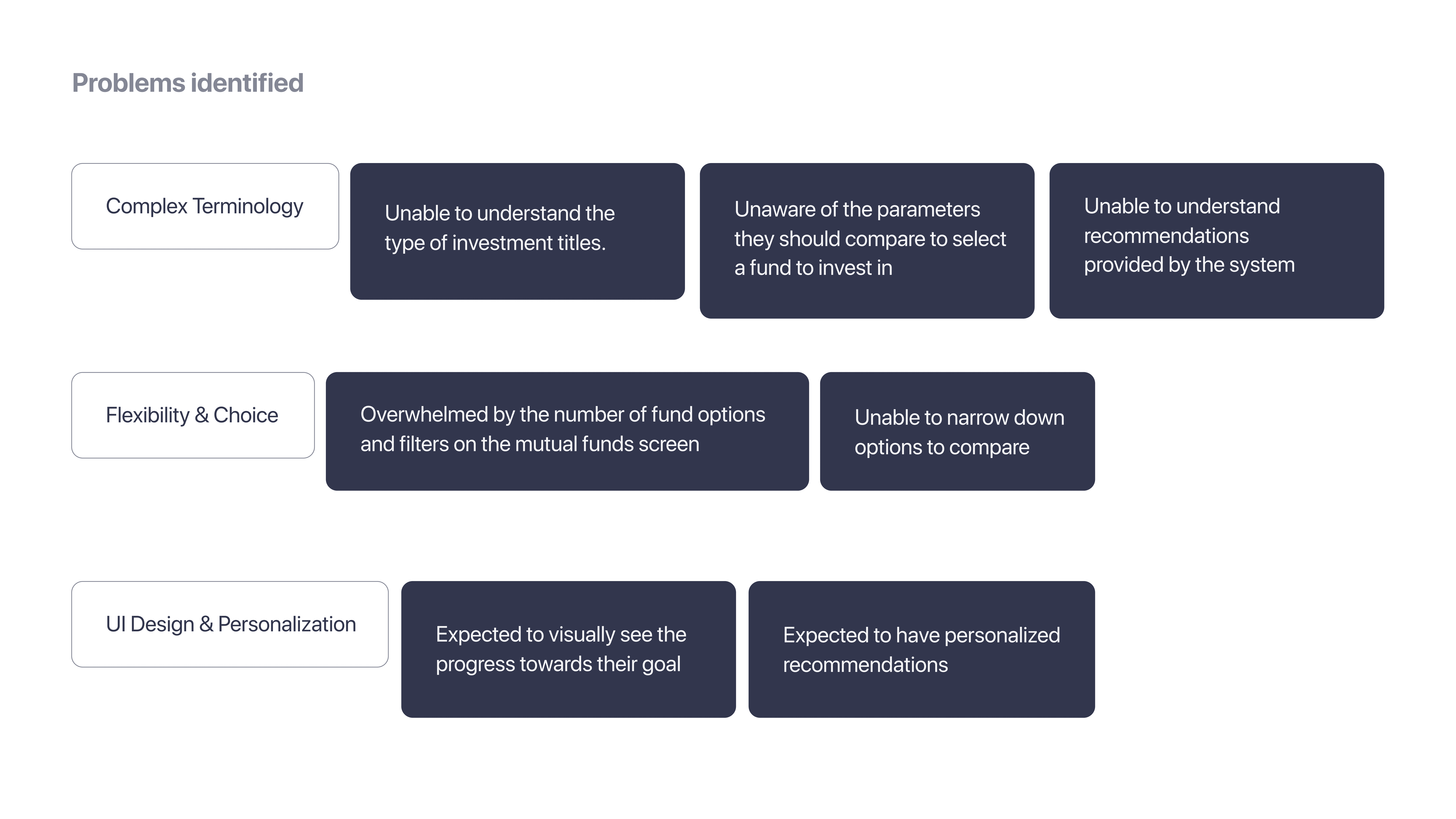

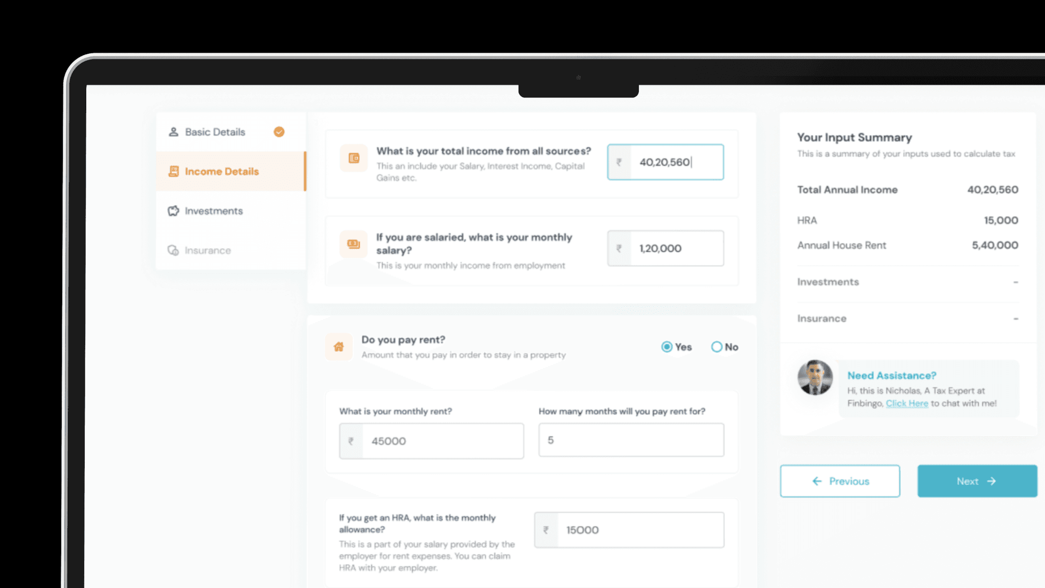
IDEA #1
Supporting text
Explain the confusing terms
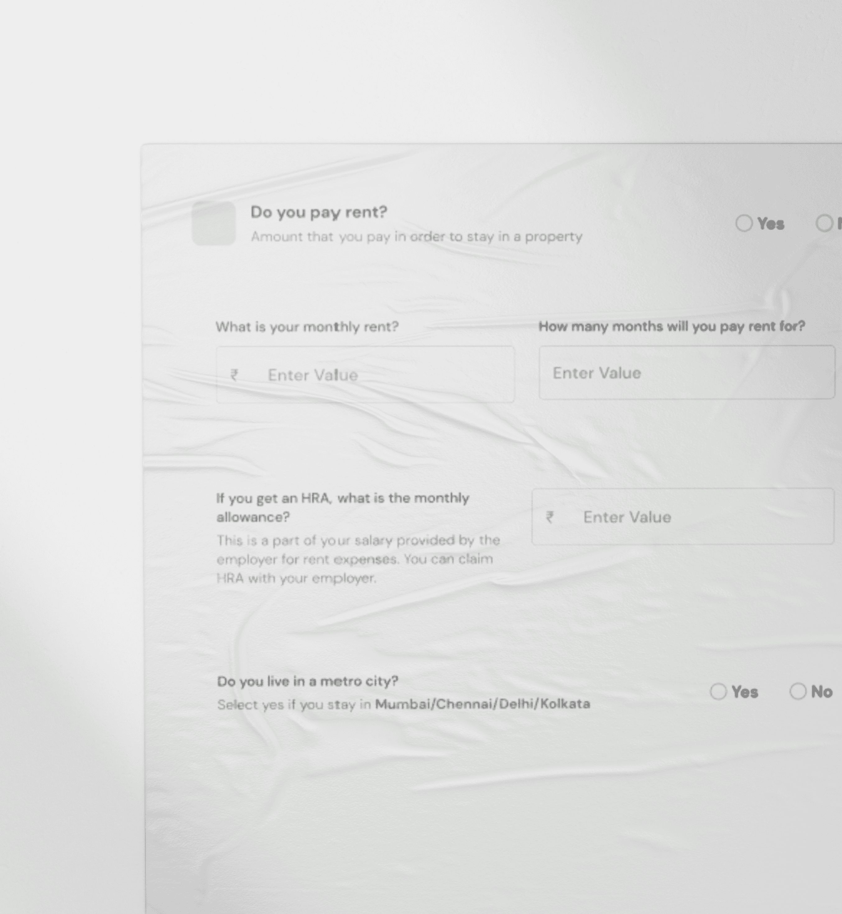
For every input field in the form, display a supporting text with added meanings for technical terms.

IDEA #2
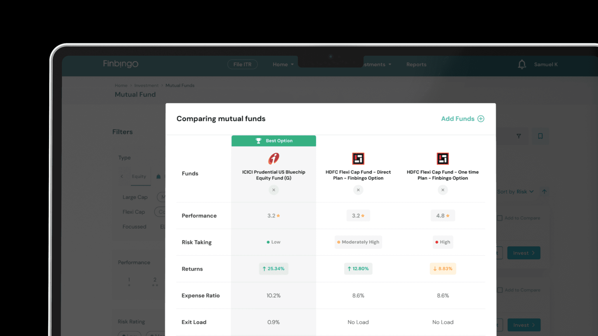
Find the best option
Parameters to compare
Highlight important parameters and show the best fund based on their investment patterns.


IDEA #3
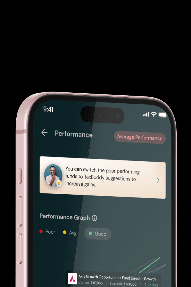
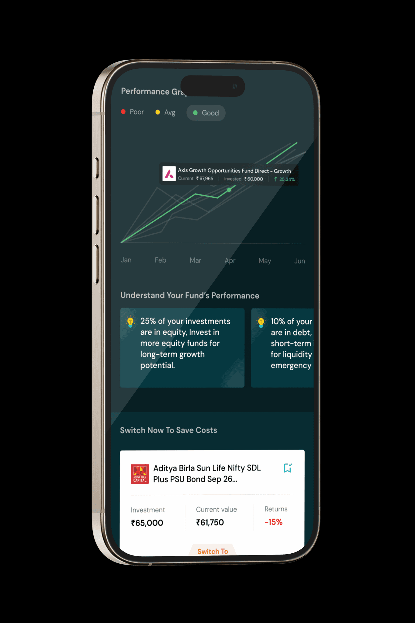
Visualize progress
Progress Chart
Actionable Recommendations
Show the user a visual roadmap towards other goal. If any, what are the actions that need to be taken?

Voices from the Process.
"The first designs were tested again in the next sprint to see if we got the expected results. Unfortunately, we had mixed feedback and needed another design approach."
After implementing a redesigned goal progress view, we conducted a usability test to see if it had improved user experience. Unfortunately, the results were mixed. Some users found the new navigation easier to use, while others still felt confused. We had to analyze the data carefully to identify the root cause of the problem and make further adjustments.
For the best experience, open the website on a Desktop or Tablet.
UX Researcher & Designer with a passion for user-centered design. Skilled in data collection, testing, and analysis to inform product development. Driven by a relentless curiosity, I explore the intersection of human behavior and digital products.